
01455 292351
dean@thegraphic.net
dean@thegraphic.net
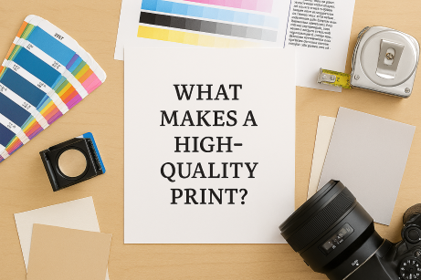
Not all prints are created equal. When you’re investing in marketing materials or branded stationery, quality matters. Here’s what actually goes into producing a crisp, professional print.
1. High Resolution (DPI)
DPI stands for dots per inch.
Always export artwork at 300 DPI to ensure sharp results.
🎨 2. Correct Colour Profiles
Screens use RGB, printers use CMYK.
If artwork is supplied in RGB, colours may shift unexpectedly.
✂️ 3. Bleed and Safe Margins
To avoid white edges or cut‑off text:
This ensures clean, professional trimming.
🧵 4. Paper Quality
Even the best design can fall flat on poor paper.
Paper weight, finish, and texture all influence the final look.
🛠️ 5. Professional Print Equipment
High‑quality printers use calibrated machines, premium inks, and controlled processes to ensure consistency across every batch.